Boston’s issues with housing affordability are well known, but the following charts are still eye opening.

We’ve been reporting on Boston’s housing affordability crisis with fair regularity, and for good reason – the higher Boston’s home prices soar, the more out of reach its housing market becomes for most consumers, and sales, inevitably, will suffer as a result.
And so it is with that knowledge we present two of the more troublesome graphs on housing affordability in Boston, both courtesy of number crunching in the latest Greater Boston Housing Report Card.
First, here is a table that looks at the percentage of income that Boston residents are committing to housing:
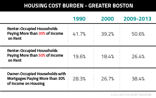
The numbers speak for themselves, but for the sake of reiteration: more than half of Boston renters, nowadays, spend at least 30 percent of their income on housing, and more than a quarter spend at least 50 percent; similarly, nearly 40 percent of mortgage holders pay at least 30 percent of their income on housing.
As the report framed it, “In nominal terms, median gross rent jumped by 56 percent from $786 per month in 2000 to $1,226 per month based on the 2009–2013 Census estimate. Similarly, median mortgage payments increased by 55 percent from $1,504 per month in 2000 to $2,327. Housing costs are part of the reason why Greater Boston is the third most expensive large metro area in the nation, trailing only New York and Washington, D.C.”
How could those numbers be so out of whack? We recently reported that Boston’s housing market is facing a critical shortage of housing units because of high demand from Millennials, but there’s another, more influential (and longer gestating) cause for that shortage, which our next graph demonstrates:
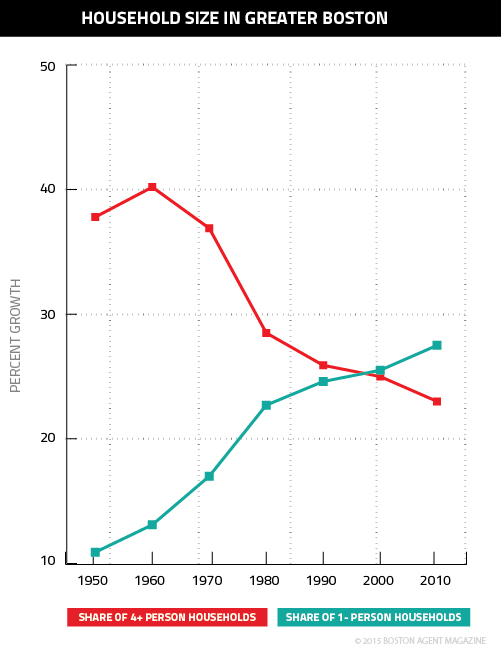
As the graph shows, there has been a remarkable about-face in Boston’s housing market in the last 60 years. Households in Boston with four or more people have fallen from a 1960 peak of 40.2 percent to just 23 percent, while single-person households have nearly tripled, rising from 10.9 percent in 1950 to 27.5 percent.
Such a radical transition places an enormous strain on an area’s housing stock, and it’s difficult to determine whether or not inventory can respond in a way that will keep affordability in check.