Source: Sherwin-Williams
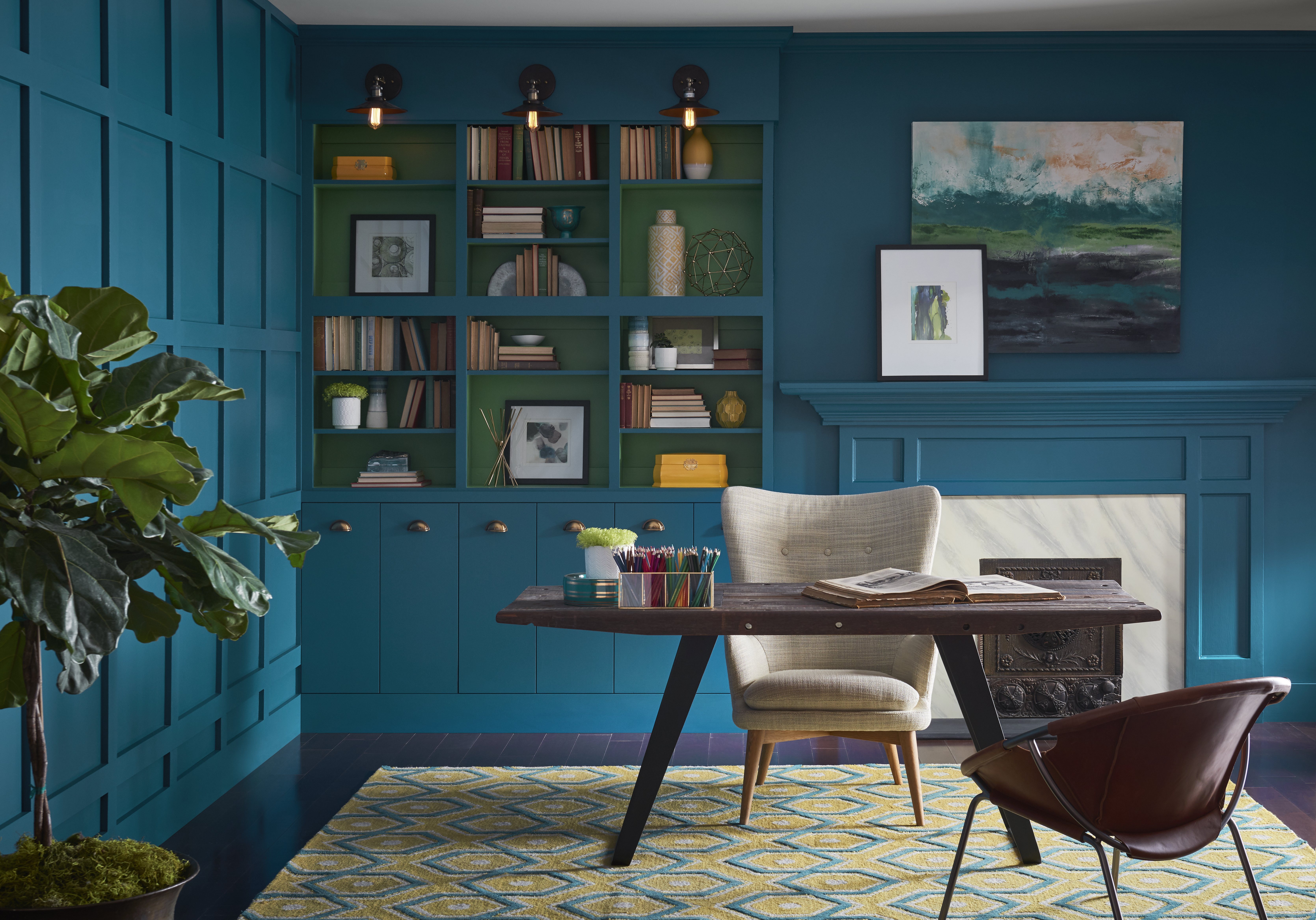
Sherwin-Williams released its 2018 Color Forecast, where Oceanside was named color of the year. Oceanside (SW 6496), a rich, deep blue color, won for its comforting warmth, while still leaving a hint of the unknown, evocative of the ocean’s same elusive appeal.
“Green-blues in deep values, such as Oceanside, respond to changes in light, which is a quality that creates intense dimension,” said Sue Wadden, director of color marketing at Sherwin-Williams. “It is a tremendously versatile color and harmonizes with other diverse color groups.”
A navy blue combined with jewel-toned green creates a mysterious, yet welcoming aura that attracts the idea of “wanderlust.” Oceanside can also give a home an beach-home vibe, even if it is not a waterfront property. Oceanside blue is known for invoking different moods based on the shade and lighting of the room. These moods are described as honest, intelligent, calm, clarity and focus.
That makes this paint color perfect for a focused office or a relaxed reading corner in a room with open lighting. Color pairings can help create the desired atmosphere for personalized needs. For example, a warm but light yellow like Honey Bees (SW 1908) or the bright eye-catching Exuberant Pink (SW 6840) will help achieve a lively atmosphere in a living room. Or, matching with dark navy like In the Navy (SW 9178) or light gray/blue called Adrift (SW 7608).
“People today have a growing sense of adventure, and it is making its way into even the coziest corners of our homes. We are craving things that remind us of bright folklore, like mermaids and expeditions across continents. Oceanside is the color of wanderlust right in our own homes,” Wadden said.
Also pairing nicely with Oceanside, are any colors that are reminiscent of nature such as copper or metallic tones, coral tones, deep greens and browns. This corresponds with the rising home trend of combining indoor and outdoor spaces within the home.
